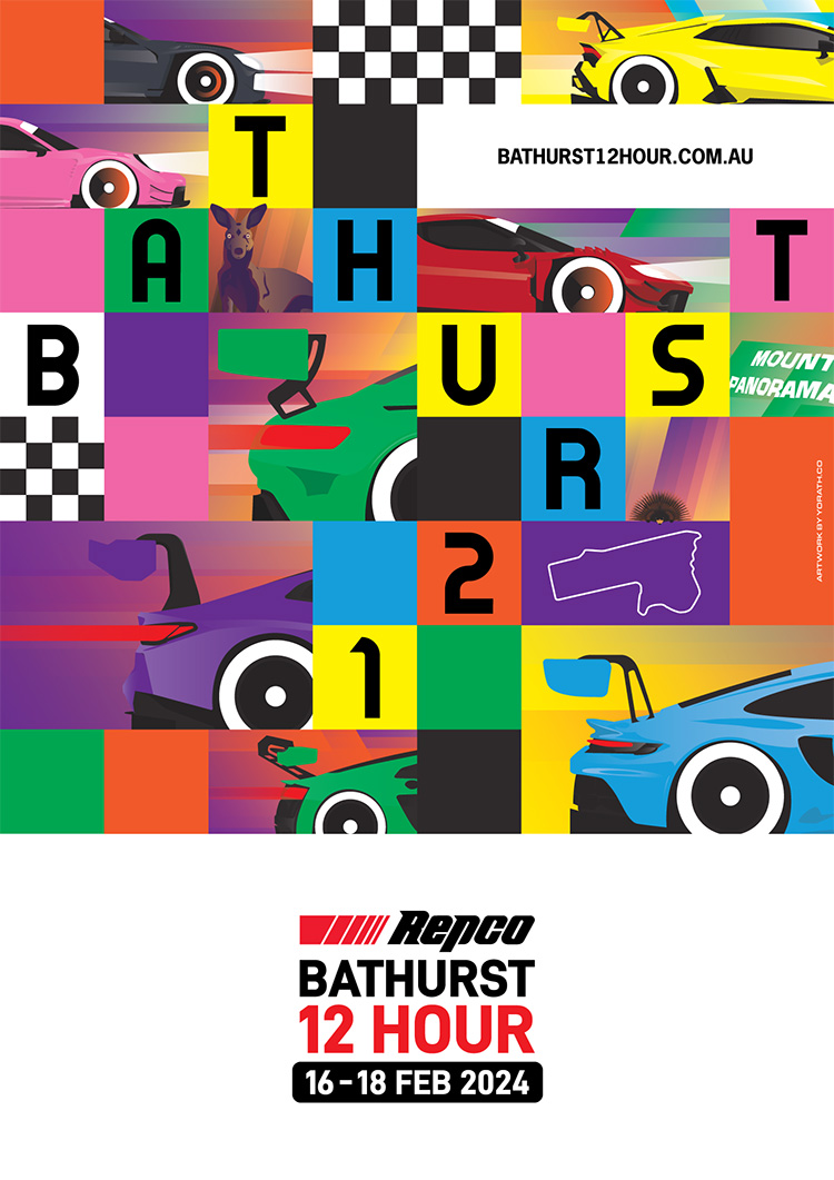
After producing the key art and poster for the 2023 24 Hours of Spa – see it here – I received an email from the team at the 12 Hours of Bathurst, asking if I was interested in producing some work for their event, too. I was thrilled, because Bathurst’s event has very quickly established itself as one of the world’s best and a fantastic advert for GT3 racing.
The brief was a relatively loose one, inviting my artistic expression. The team were keen to highlight a few things: as many GT3 cars as possible, including the brand new Lamborghini Huracan GT3 Evo II; the fact the event is a festival of motorsport and a family-friendly attraction; some local wildlife; the web address, logo, and space for partner logos; and, of course, the Mount Panorama circuit. They also pointed out that the art would potentially be used to create various promotional pieces across different digital platforms.
With all this in mind, I took a step back and thought about what motor racing looks and feels like to me. It’s a visceral experience – something I’ve mentioned before – and a colourful, loud, exciting and vibrant feast for the senses. When I was in initial conversations around the project, my experience and history in motor racing was seen as a key point in my being chosen for the project, because I understand the sport and how it works. I wanted to make sure they got the best of that!
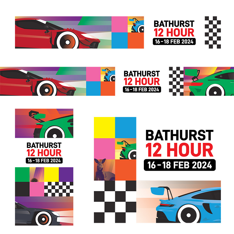
The squares came from my love of the work of artists like Piet Mondrian, whose work is able to both be regimented and structured whilst also free and energetic. It allowed for the constituent parts to exist together without having to be awkwardly crammed together. To my eye, it has a carnival-like, bustling energy but without being overcrowded. I also wanted to be able to break the poster’s elements up, so that it could be re-arranged into different shapes for the team to use if they needed to.
The feedback from the marketing team was immediately positive and I’m so thankful to them for their support in going for something a bit wild, but absolutely unique in the motor racing world.
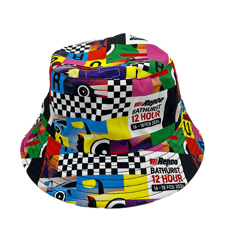
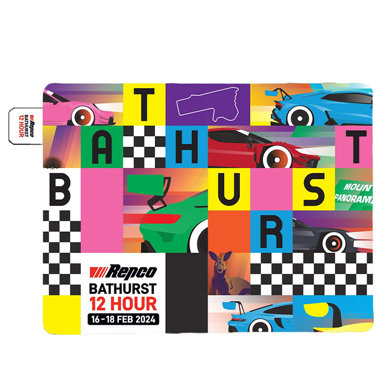
Images, top to bottom: The key art, as I delivered it; Merchandise featuring the design was hugely well received, including the bucket hat; and picnic blanket; One of the key features of my concept was that it could be broken up and arranged at will, used to create adverts in different ratios and sizes for web use.


