Over the course of 2021, I was brought in by Porsche Great Britain to produce some eye-catching social media graphics for the Carrera Cup GB and Sprint Challenge series, as well as a hero poster for each.
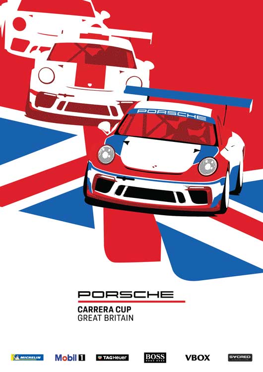
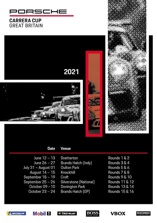
Firstly, we drew up hero posters for each series, placing the cars front-and-centre and using halftone shading for a vintage feel, which would be replicated throughout the season. The use of Porsche’s modern fonts ensured that the art didn’t feel too aged, and still met CI.
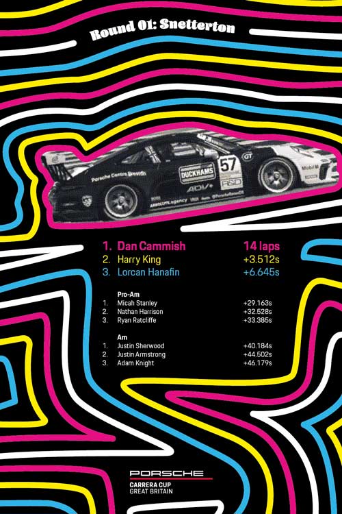
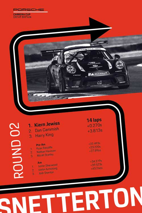
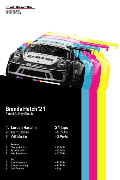
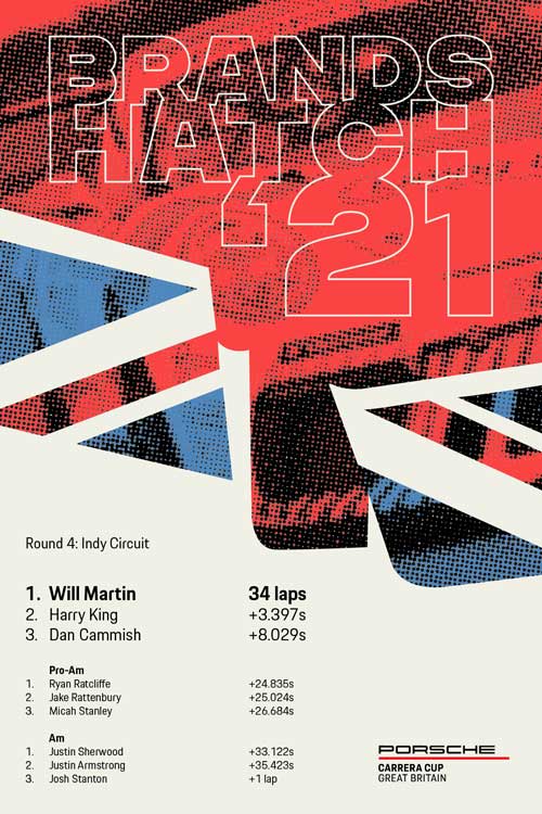
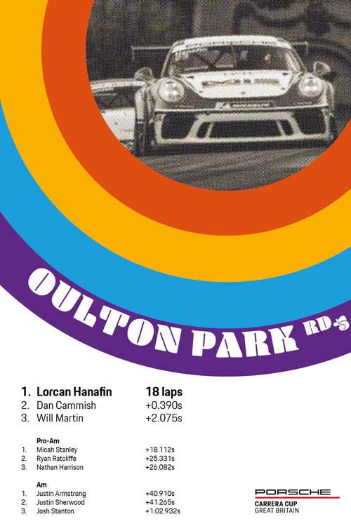
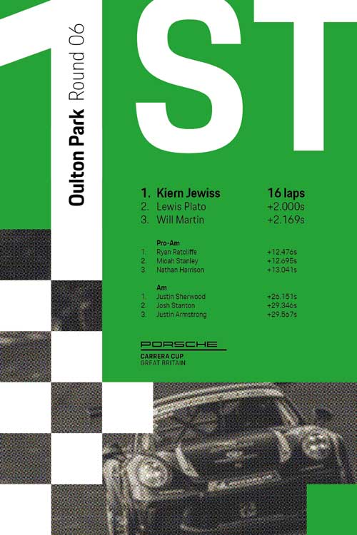
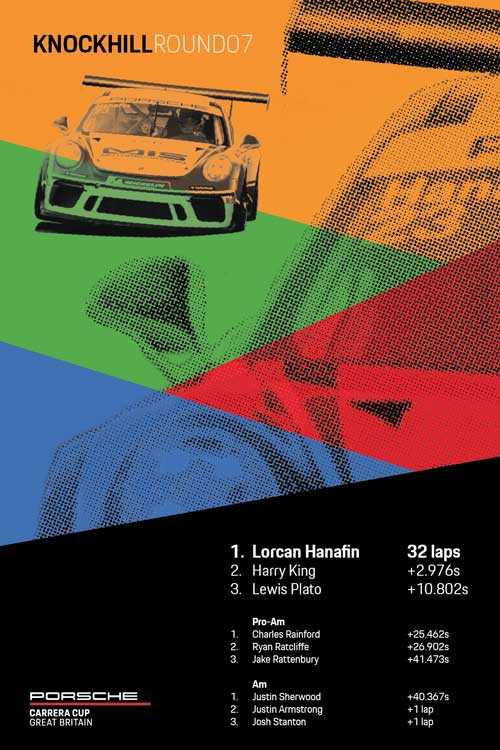
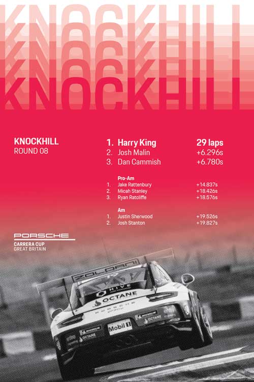
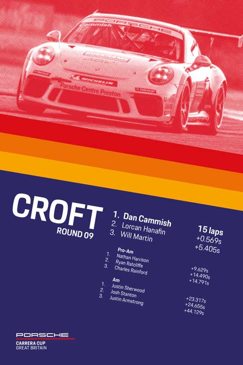
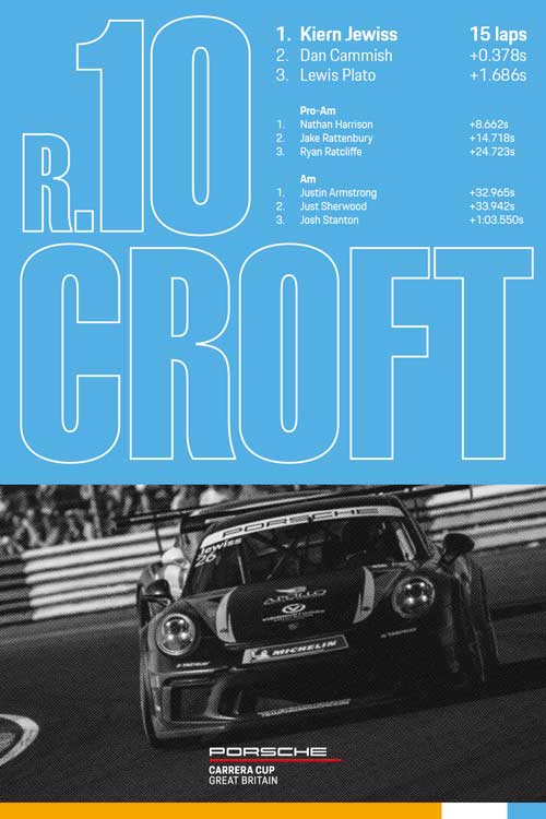
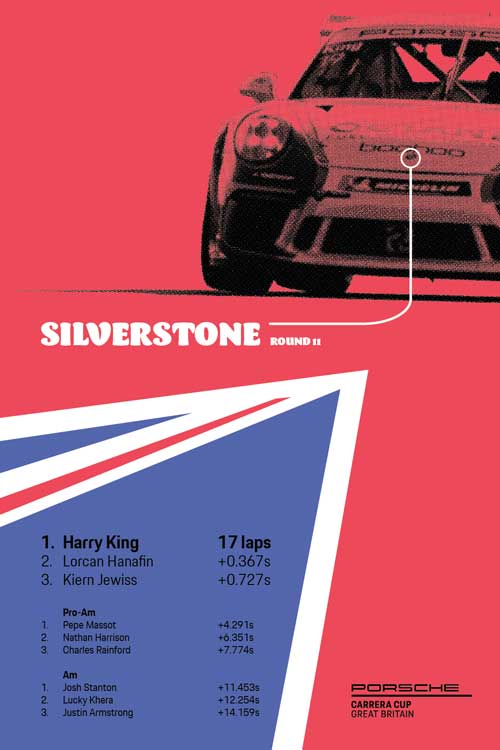
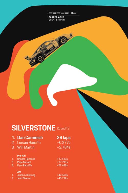
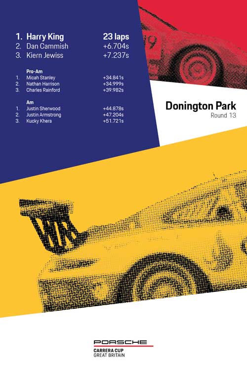
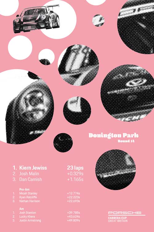
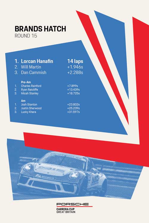
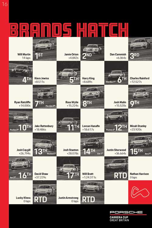
In consultation, we then drew up a plan to produce classic Porsche victory posters for each round of the Carrera Cup, which would be designed ahead of time and then edited on-site by photographer Dan Bathie for publication on social media. Each was designed to be specifically easy and quick to edit, with a photo of the winning car and results of the race. To enable this, I wrote up step-by-step instructions to replicate the draft document for each poster. I also created the draft images by using photos Dan had shot the previous year that he would likely already be shooting on Friday or Saturday, ensuring that come Sunday he’d have the right photo ready to place into the file without any trouble.
Though they had to be relatively easy to edit, they still had to look great and fit the great canon of Porsche’s art over the years. For example, the Union Flag used on the season poster for Carrera Cup, as well as the fourth round of the series, is brought in from a Union Flag graphic used several times by Porsche’s art team during the 1970s and ’80s.
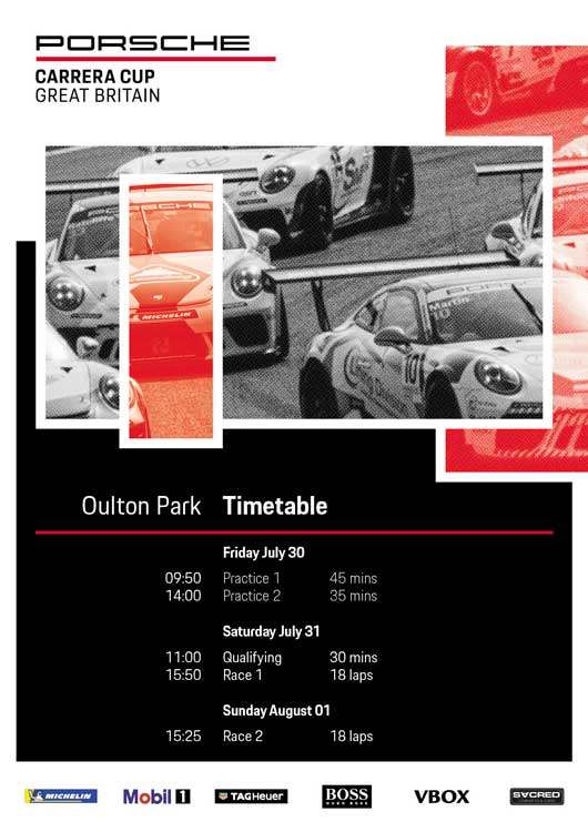
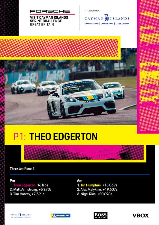
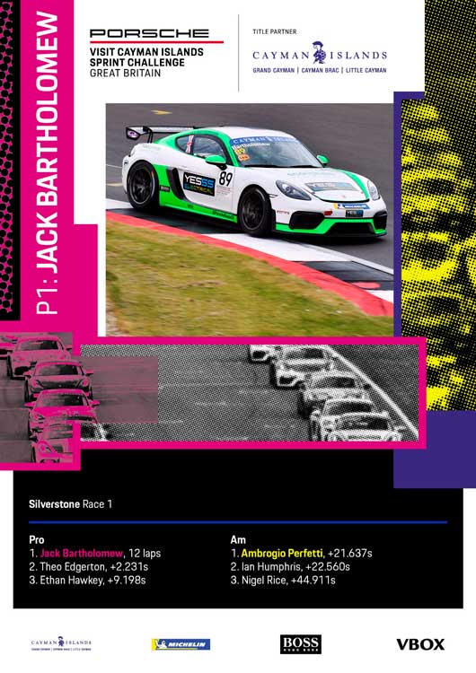
For the Sprint Challenge, we produced much more simple repeat graphics for race winners, which used bold colours and half tone to mirror the Carrera Cup’s look but differentiate a little. For both series, there were calendar and weekend timetable graphics, too. The entire project leant on Porsche’s significant history with graphics whilst creating a distinctive visual language.