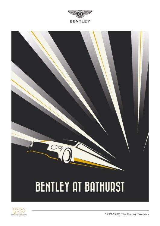
I’d been making posters for Bentley’s GT3 racing for a few years and, for 2019, Bentley’s 100th year, we knew we had to do something special to celebrate. In discussion with the client, we reached the decision to produce 10 posters for 10 different events the brand would race in, with each celebrating a decade of Bentley’s history in its artistic style. I kept the palette as minimal as possible, based around Bentley’s centenary gold.
From top to bottom:
‘20s, Bathurst. The theme here was very much Art Deco. I referenced the great art of the age, with the car’s speed harking back to the famous races to build ever faster trains, boats and planes as well as cars.
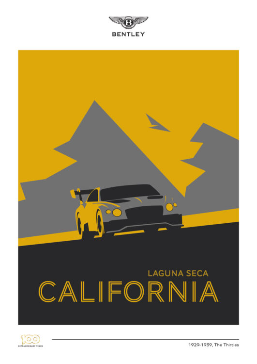
‘30s, Laguna Seca. One of the main pillars of Bentley’s appeal is its luxury value. I wanted to represent that with a nod toward the golden era of travel posters, with the Continental GT3 highlighted against the local scenery in golden Californian light.
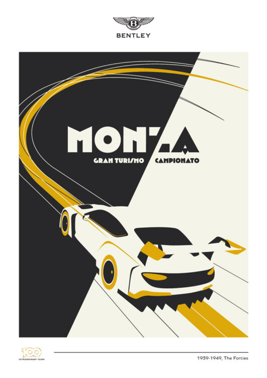
‘40s, Monza. Sometimes, an idea just comes to you and sets a lightbulb in your head, and thus it was for the black/white split down this piece and the ‘Z’ of Monza.
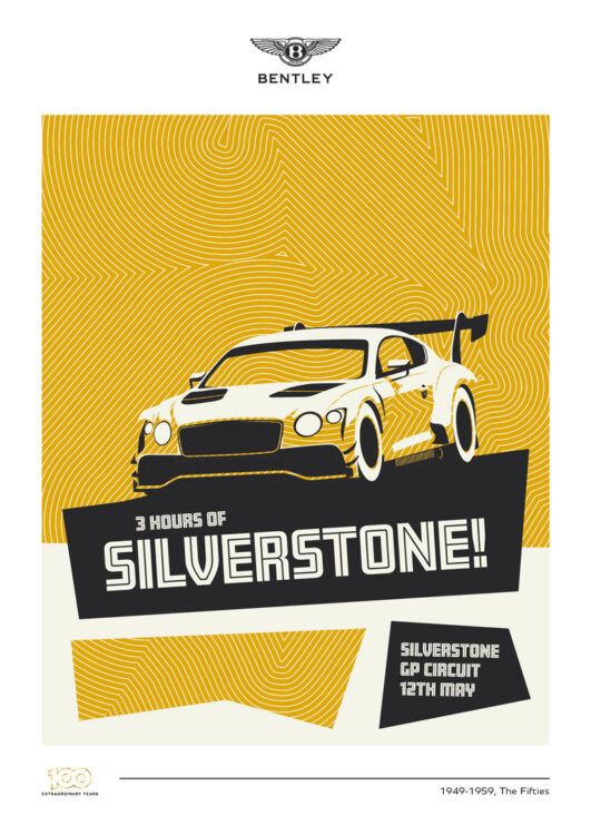
‘50s, Silverstone. This was inspired by Saul Bass’ fantastic movie posters of the decade, and also by Silverstone’s track itself – the stripes in the background are the circuit.
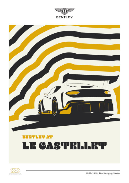
‘60s, Le Castellet. With stripes like this, you can almost see Twiggy and the Rolling Stones enjoying this race. They also mimic the famous track stripes at the Paul Ricard circuit.
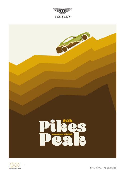
‘70s, Pikes Peak. Bentley entered a more-standard Continental at the Pikes Peak International Hill Climb, and asked me to use the car’s livery too. I used some classic ‘70s brown shades to suggest a mountain’s shape.
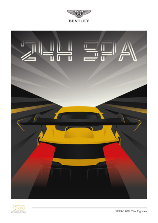
‘80s, Spa Francorchamps. Spa is the biggest race on the GT3 calendar and a 24-hour race is always a challenge to capture in one single print. I was happy with this combination of a ‘digital’ font and the streaking lights.
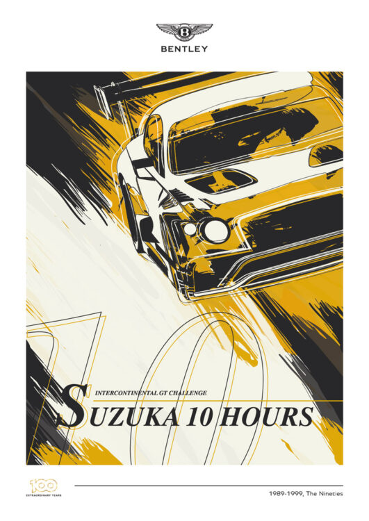
‘90s, Suzuka. Design in the ‘90s was this bizarre combination of wild colours and shapes, with really business-like fonts. I aimed for that feel, with a crazy illustration and simple serifed font.
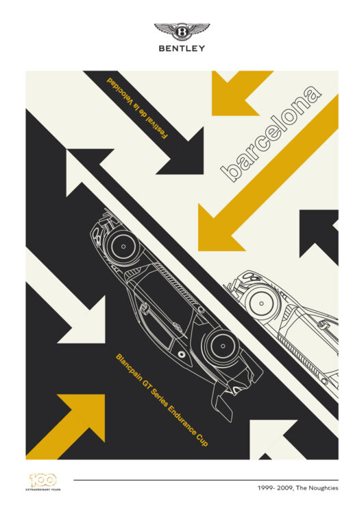
‘00s, Barcelona. The first decade of the 21st century definitely saw a move toward cleaner, simpler design. I wanted to tie that in with some bold contrast, and some nice restrained detail in the car’s outlines.
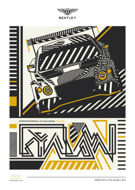
‘10s, Kyalami. This was a chance for me to experiment a little. Drawing inspiration from modern South African art as well as my own recent work, I went bold and loud.